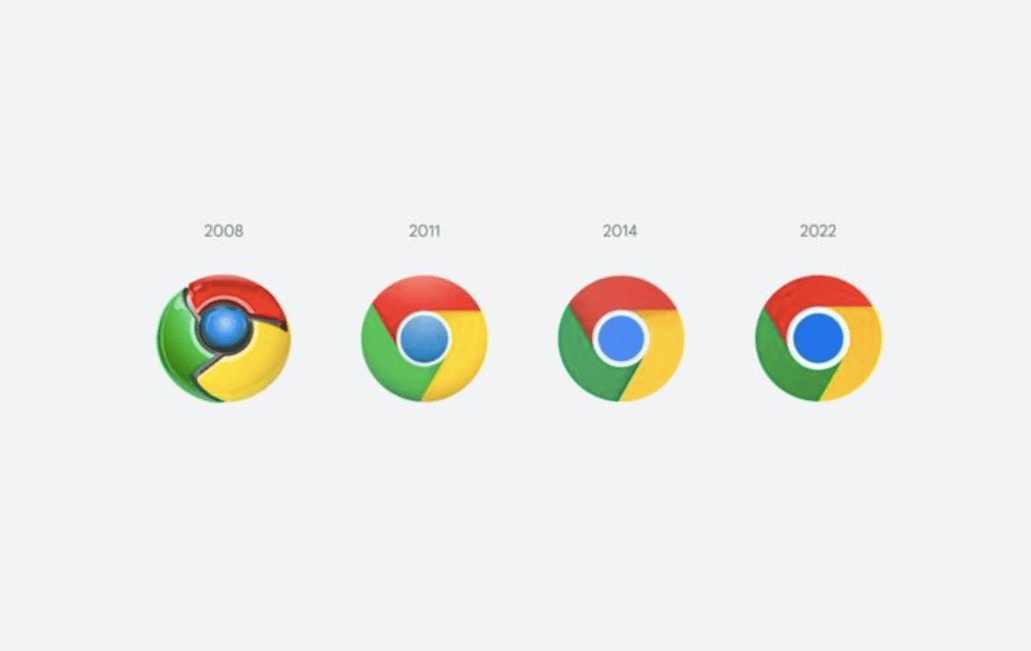
Google has unveiled a new subtly redesigned Chrome logo recently, marking the first time Google has revamped the icon in eight years. Google has removed the shadows from the icon and made the colours brighter.
Google designer Elvin Hu has actually revealed the process behind the new design on Twitter, which was spotted by The Verge.
Some of you might have noticed a new icon in Chrome’s Canary update today. Yes! we’re refreshing Chrome’s brand icons for the first time in 8 years. The new icons will start to appear across your devices soon. pic.twitter.com/aaaRRzFLI1
— Elvin (@elvin_not_11) February 4, 2022
As mentioned, the shadows have been removed with a much more flat design. The shadows were added in during the ‘Material Design’ era of Google, but Hu said the older colours had an “unpleasant colour vibration”, especially the green and red together but the new icon is helping to make it “more accessible.”