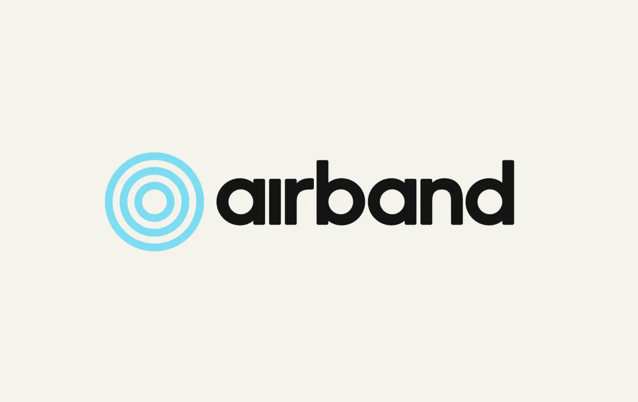
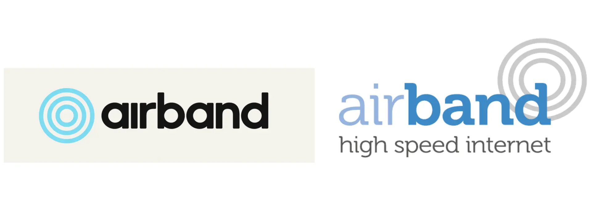
Today, UK ISP Airband has unveiled a brand new logo and a fresh new website design. The new logo keeps the same three circle design, but uses a new font and removes the dot from the i. The entire website has been given a huge makeover, with cartoon animals to depict every aspect of the process from ordering broadband to getting free Netflix.
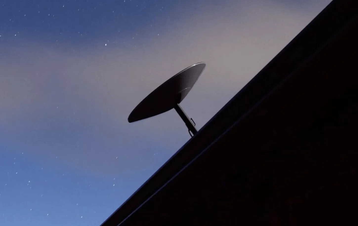
Airband is based in Worcestershire and has traditionally been wireless ISP (WISP). In recent years, it has been rolling out its “full fibre” (FTTP) networks to rural areas including Devon, Oxfordshire and other parts of rural England. Airband has yet to release an official press release discussing the new brand design and new look website, but this should be expected soon.
The new look website can be found at airband.co.uk
Update: A few days later, Airband has shared a new video on its LinkedIn profile.